
Top ten covers I wish I could redesign. Ok, just one then.

I never did the 30 day challenges (I can't count on myself not to flake out on something that long and have to do the last 22 days all at once :) but the top ten tuesdays I could do. Except it's wednesday. Because there was a train accident in Stockholm yesterday and I got stuck staying the night in the city with no laptop (thank heavens for a tablet loaded with a bajillion books!). Which I wouldn't have minded so much if I was working today, but I have today off!
So anyway, The Great Gatsby. I know it's considered an iconic cover but I have always hated hate hated it. Wikipedia and some dude at Princeton call it "among the most celebrated pieces of art in American History", and it's painted by Frances Cugat. Who I've never heard of before, and if this is what his art looked like, that's fine by me. Also, Ernest Hemingway agreed with me that it's horrible, and apparently even Fitzgerald himself grew to dislike it. So I've been redesigning this in my head for YEARS already.
 There have been a couple of redo's over the years, but I can't say I like them much either. The lady with the red hair here, is from the 1988 penguin reissue, and while it's better than the original, the cropping is beyond awkward. I would have had her face tipped a little back, and cropped it so you could at least see an eye (the styling is rather gorgeous, I bet the eye makeup, if you could see it properly, was beautiful.)
  Then there is also this lovely black and white photo cover from the current Penguin version, which I think is a vast improvement over both the other two, particularly the typography, but still doesn't quite push all my buttons.
I can't draw for beans, but I would have done something very art deco. I can't help but think of those forced perspective train posters, crossed with something like Fritz Lang's Metropolis city skyline.All done in cool greys and monochrome, perhaps with a splash of the yellow car.
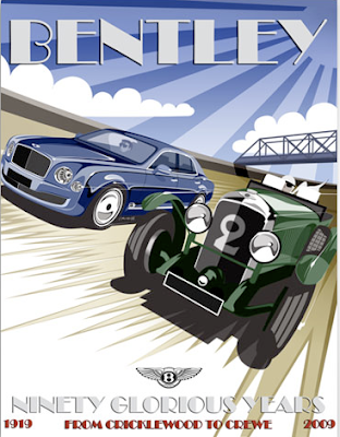 And a bit of hunting, came up with this, which is almost exactly what I had in mind (and doesn't actually need the city skyline - or the bridge, really). One car, or the second car further back (and obviously not a modern one), make the car yellow, draw it in a little closer and make the silhouettes of the people a little more clear, cool the blues even more, and pop the typography out a bit more. Also this font is a little over used, I rather like the one used on the second penguin cover above, Avant Garde, or maybe Aeronaut which is still a classic Art Deco look, but not so overused.
Of course, there may be a reason I don't design book covers, but I do know what I like, and what I don't like. And I really hate that Cugat painting!
ETA: see also: http://thewishwashingtonpost.tumblr.com/post/61271580727/september-15-2132-according-to-a-recent-study
 3
3
 8
8


